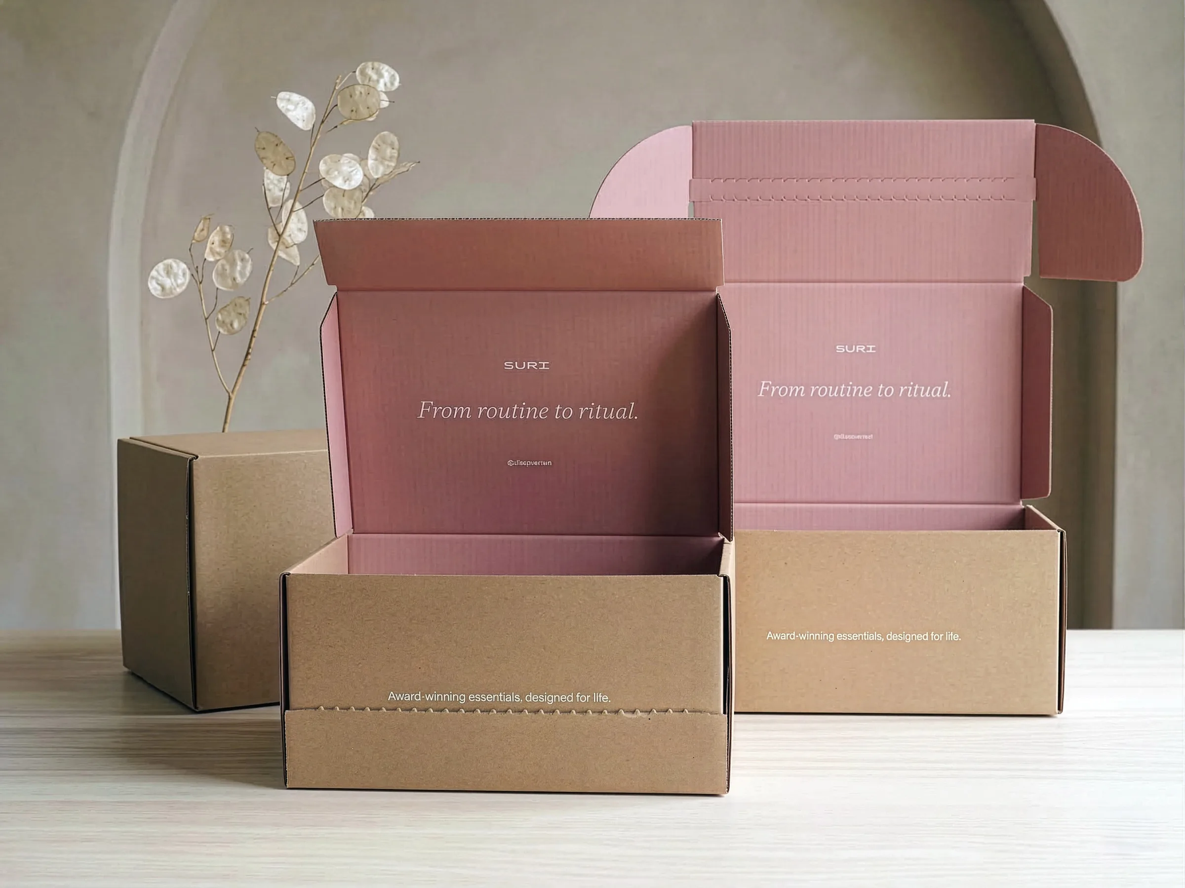
Colour is an integral part of your brand’s identity. We understand that when you trust us with your packaging, you also trust us with reproducing those colours so they feel just right. And feel is an important word here because colour reproduction is an art and a science.We will dip into a bit of the science here but also outline what you can do to make sure your colours feel right on your custom packaging.
Can you match my brand colour exactly?
The short answer here is no. No packaging partner or manufacturer can promise this because of the variability between raw materials (dyes), substrate (e.g. paper) and light.But we can get close - how close will depend on the following factors:
- Print process - some inks make colour accuracy easier.
- Substrate - papers have different natural colours e.g. some may be more white than others or may absorb more ink. Printing onto non-white materials creates additional complexity.
- Light - the naked eye will perceive colour differently in different types of light. It is also true that some people can see more variation than others.
What’s the best way to get accurate colours in packaging?
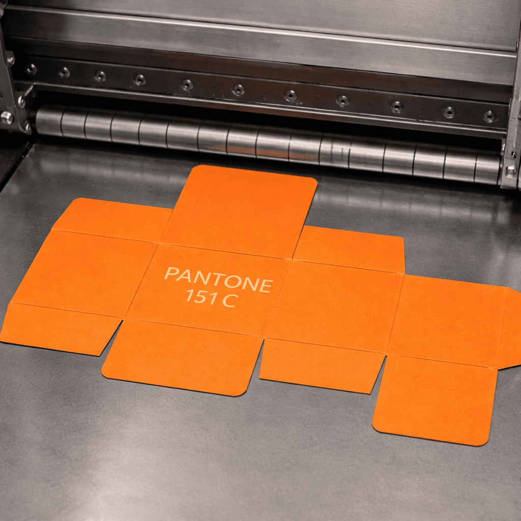
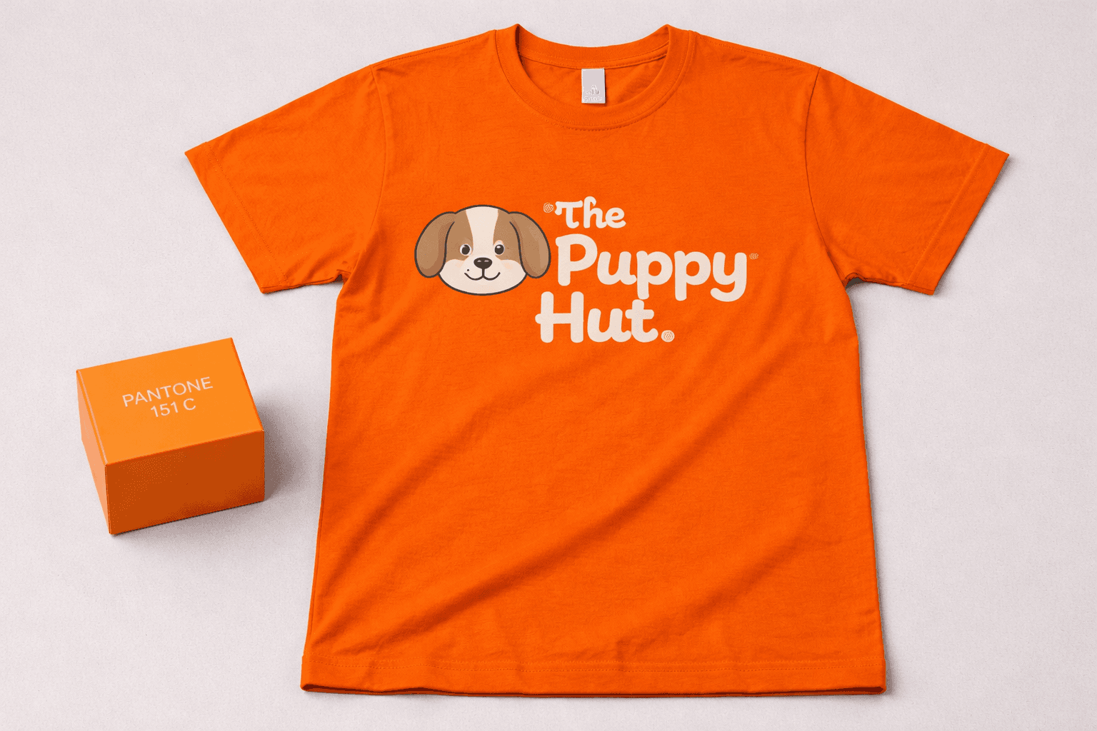
The easiest way to match colours in packaging is to use a Pantone reference. This is because ink manufacturers have ready formulations for most Pantone colours making it easier to get the close first time of trying.
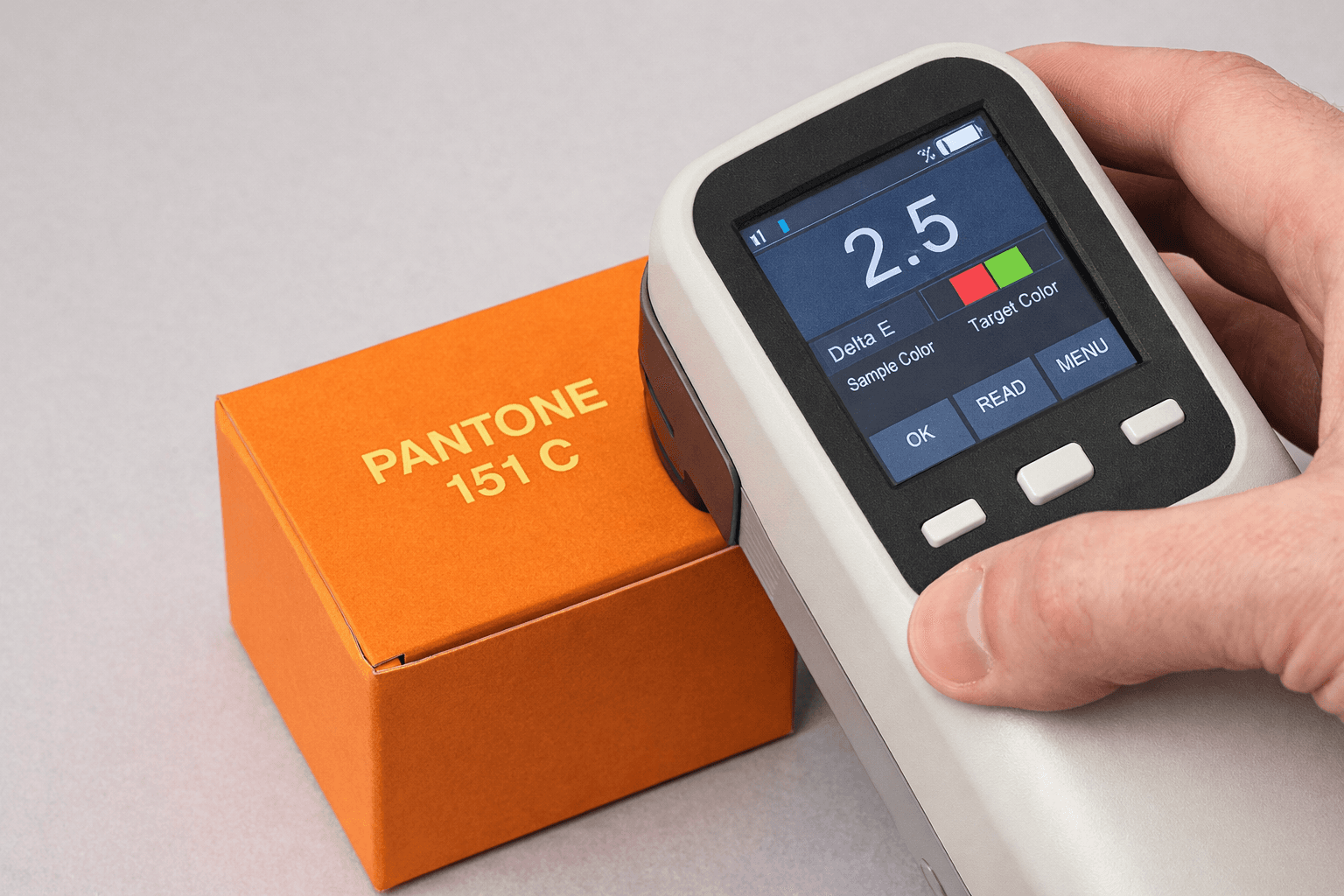
We can measure how accurate a colour is using a spectrophotometer and ideally we would aim to replicate a colour closely enough that your eye will struggle to see the difference. A scale called Delta E is used for this and readings of below 3 means that most people will struggle to see a major difference.Sadly, this doesn’t mean perfection though because the feel of a colour will usually be the most important factor. For example, a pink Pantone that measures between 2-3 Delta E is technically within the best industry standards. But the colour might feel “too yellow” or “too blue” or “not pink enough.
So how do I get the feel right?
Time. The best way to get the colour that you want is to allow time. With plenty of time we can potentially help with:
- Colour Swatch - a small piece of material with your colour applied by hand.
- Full Sample - See (link to our blog post on samples) our companion piece on samples
- Provide us with a colour reference - if you have a physical item that shows the colour as you want it we can use that to try and match to
- Iterative Improvement - we can dial in colour over different production runs to get closer to the correct feel.
Is colour accuracy possible across different products?
Yes and no: we can match across products and materials to a certain extent but perfection is rarely possible. We work with multiple clients to create as accurate a match as possible but we can never promise exact matches. The best way is to create one product first (e.g. a mailer box) and then use that as the master reference. That will give you the best chance to get a close match to other items (e.g. metal tins, pouches, glass jars). But that approach requires time. Alternatively we can tell what the colour accuracy range will be for each product.
Coca-Cola Red
Coca-Cola has strict controls on how its colour is reproduced in packaging. They have an added complexity of manufacturing across all continents in many factories. They take great care in protecting Coca-Cola Red but even a multinational has to compromise across products, materials and geographies.Coca-Cola has accuracy standards (they aim for below Delta E 3) but they accept a natural variation because they need to be practical. See below for how their colours compare in the UK.
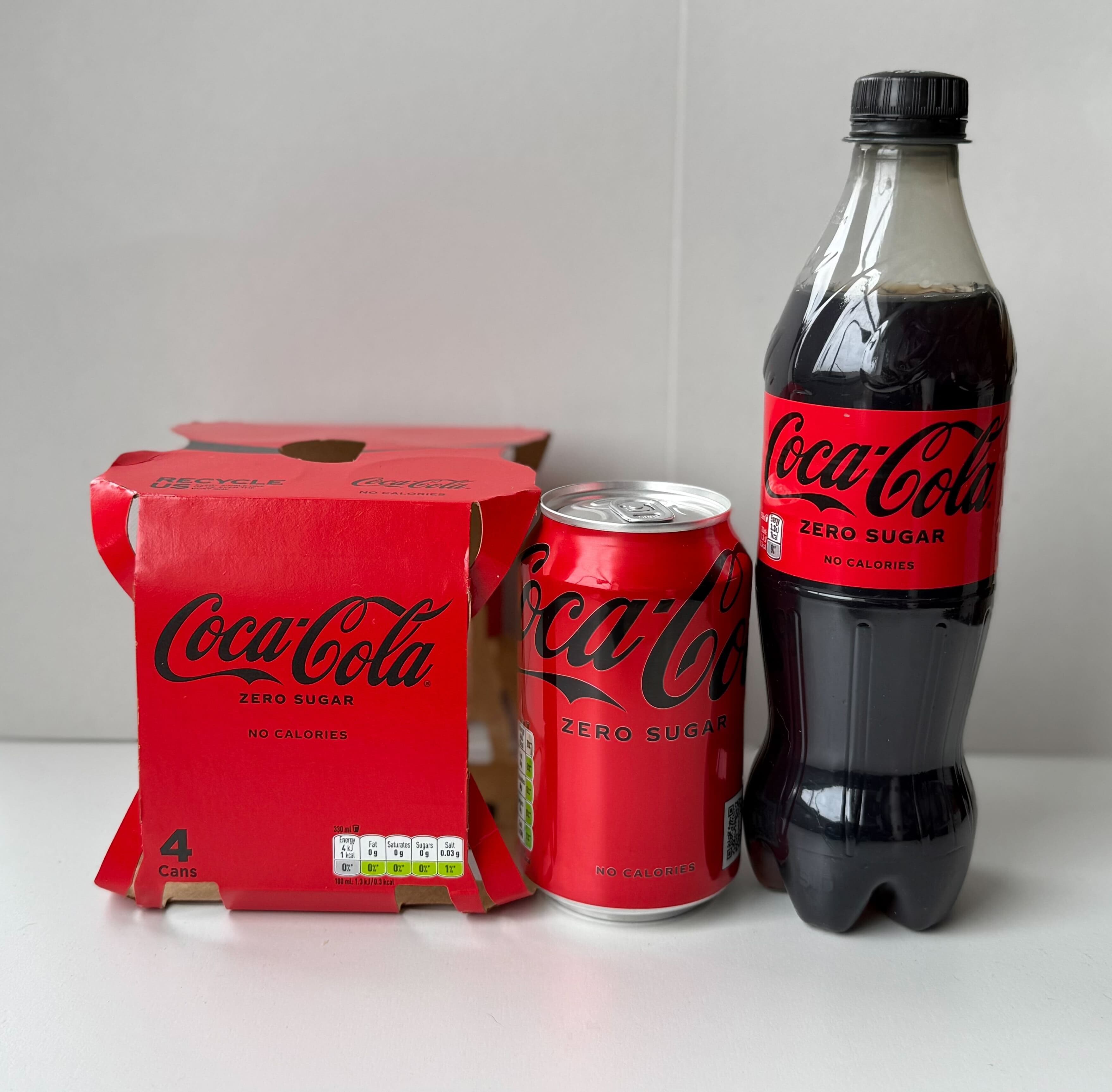
At first glance your eyes will probably be happy with the closeness of the red colour. Nothing here is obviously jarring. Now let’s take a closer look:
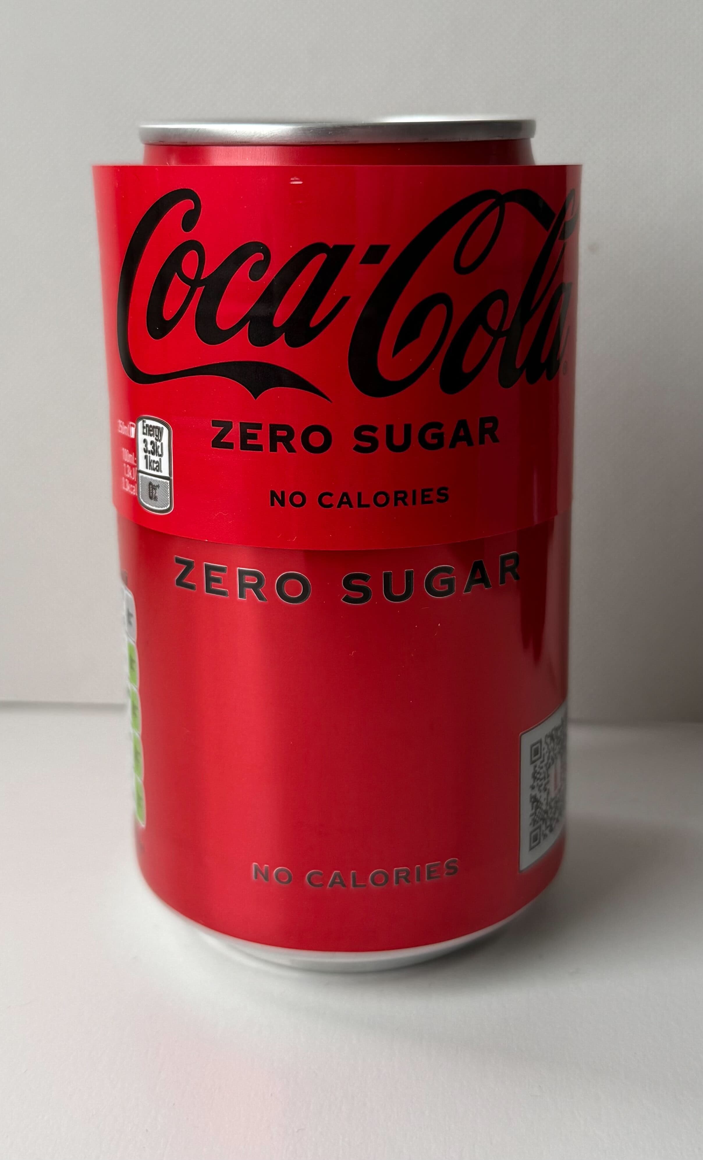
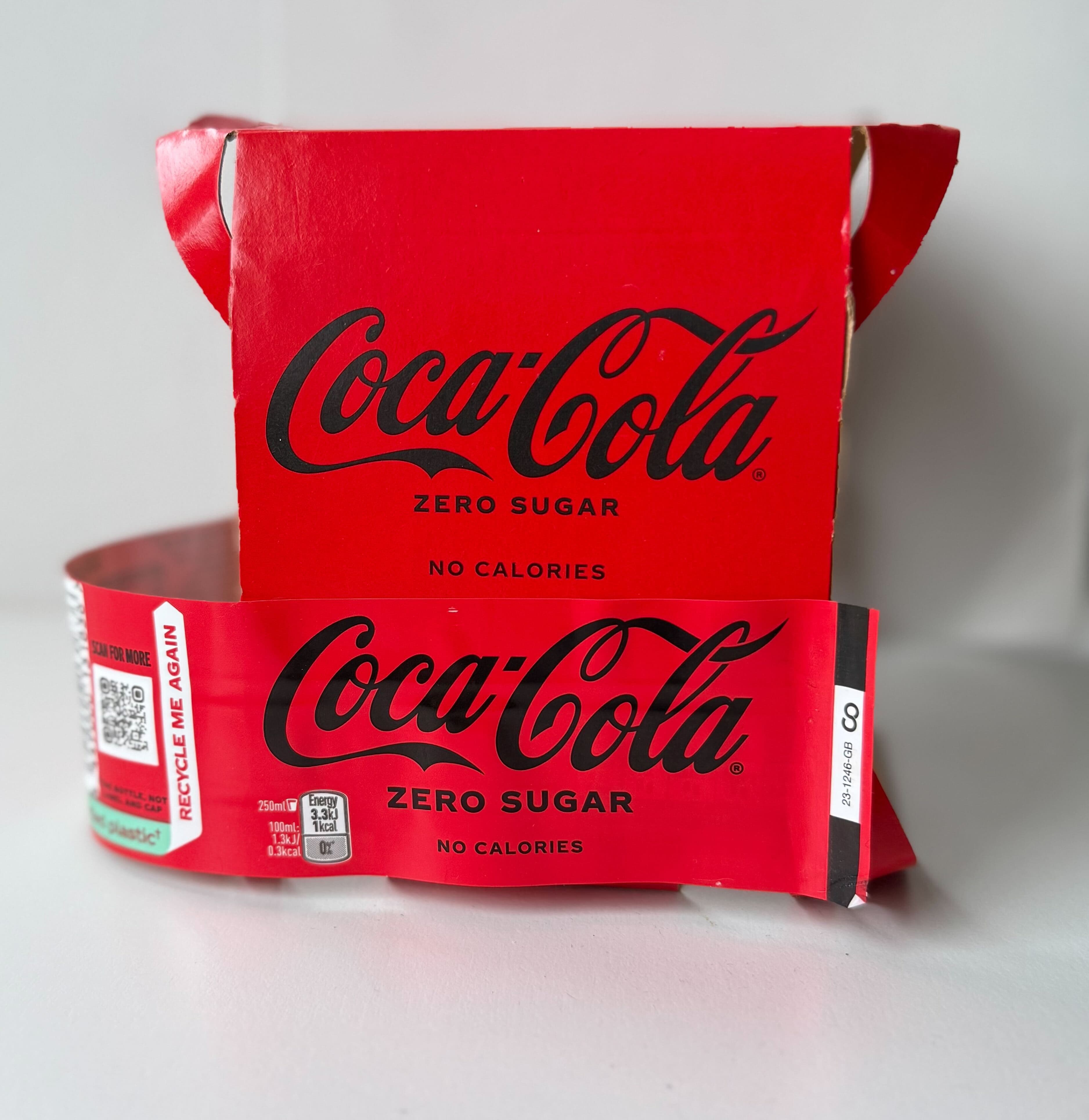
What we see here is a mix of materials and print processes: metal can, cartonboard box and plastic label. Now let’s look closer at all 3 colours:
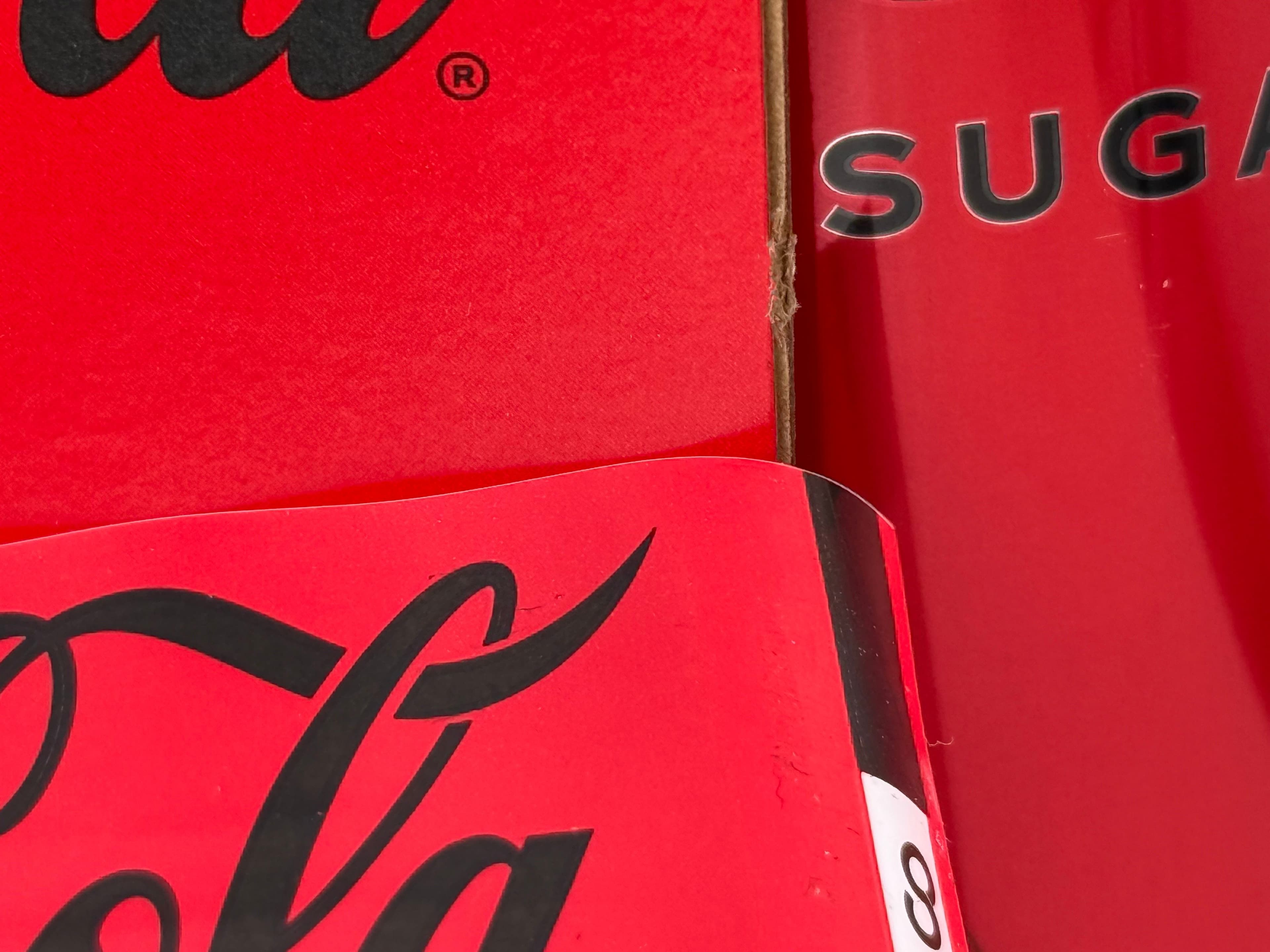
In close up and with light reflection, you can see that all 3 reds look different. Nothing to worry about and within tolerance but never perfection.
Why is colour accuracy different across different print processes?
There are several factors that influence colour accuracy:
- CMYK print colours are always less accurate - they are made up of 4 base colours. If you choose digital printing, this will be your default option. Litho / Offset printing is also often CMYK but pantone colours can be produced very accurately using this process.
- Substrate - the base material (e.g. paper, plastic, glass) will all affect the finished colour. While we will work to ensure overall colour accuracy, a pantone red placed on blue plastic may look wrong to the eye. Substrates will also vary between productions.
- Ink - inks are typically formulated for the substrate. Some are relatively transparent (think of watercolour paint) while others are much more opaque (think oil painting). Different ink manufacturers will have their own interpretation of a Pantone colour.
- Pantone has coated inks and uncoated inks: which one is used depends on the print process. You may need to use both for different projects which will lead to natural variation.
- Direct vs Offset print - direct printing (e.g, Flexo) means that material imperfections and dust can affect the final finish and make the colour look less accurate.
- Lamination - when a product is laminated with a film (often to create gloss or matte finishes) it will affect the colour. We can always adjust on second production runs if there isn’t time for a sample.
- Curing - when ink dries, this can affect the final colour. Consistent controlled drying is the best way to ensure that this doesn’t cause unwanted change.
The science of colour matching
We touched on the science earlier but let’s take a more in depth look here. First we’ll start with spectrometers - the instruments we use to measure colour.
What is a spectrophotometer?
Spectrophotometers (Spectros) were not invented to measure colour - they are more generally used to measure a spectrum of readings across a range. In the case of colour, we use them to measure light spectrums. It works by shining light onto solid surfaces (like plastics, fabrics, or paints) and measuring the reflected light. This allows us to create a reading on how close a colour is to the ideal Panton reference.This might sound complicated but it gives us an indication of whether a colour will be noticeably different to the human eye - will the average person notice a major difference? A spectro will give you a reading in Delta E - anything less than 3 is considered excellent. Depending on the print process we might be able to achieve reading between 2 - 7. While 7 might sound extreme, it may not be noticeably different to your reference colour.
Here’s a good video explaining how it works - https://www.youtube.com/watch?v=kXsCJwBIX14
Inks
Inks play a major role in colour accuracy. Transparency (water based inks) or opacity will affect how our eyes perceive colour. Pigments vary from batch to batch meaning that an ink will never be perfectly reproduced each time but will still meet the Delta E target range.
A good way to think about this is if you’ve ever redecorated your house and had a particular colour paint mixed. But you’ve run out before you’ve finished and need to get more. Chances are that the next batch will be ever so different. Maybe it won’t be too obvious but you notice it as you put the finishing touches to the room.This is also a factor when you print large runs of packaging: the manufacturer can only mix a maximum volume at the time and will have to remix more ink during production. You’ll likely never notice but there can be natural variation in a single production.
Got a project in mind? Talk to us
Let’s have a chat - we can talk through all options and tell you how closely we can match your brand colour on any project. Or chat to our knowledge hub here.